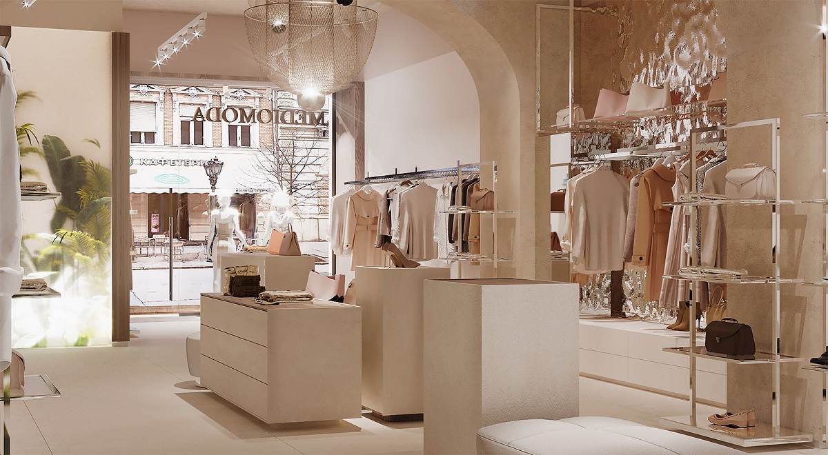
When designing, the first puzzle to solve is the store layout. Its nature depends primarily on the space where the store is located and, immediately after, the type of goods you’re selling. Well-chosen store layouts contribute to the overall impression of the store, enhancing the visitor’s experience by creating an organized space where customers can easily navigate. If you manage to make them feel comfortable and align the design with their natural behavior, and habits, customers are likely to spend more time, boosting your profits. A strategically utilized space will ensure that the flow of customers aligns with your marketing strategies.
Which store layout should you choose for your retail space?
1. Grid
This is likely the most common layout you’ve encountered many times before. It involves shelves parallel to the walls, making efficient use of space. This straightforward and economical solution can accommodate a relatively large number of people simultaneously. It’s easy for customers to navigate, and owners find it practical for organizing products. Keep in mind that although this solution is cost-effective, it may not be creatively sufficient for certain types of merchandise. Be cautious not to overcrowd the shelves, as it might lead to the opposite effect of what you desire.

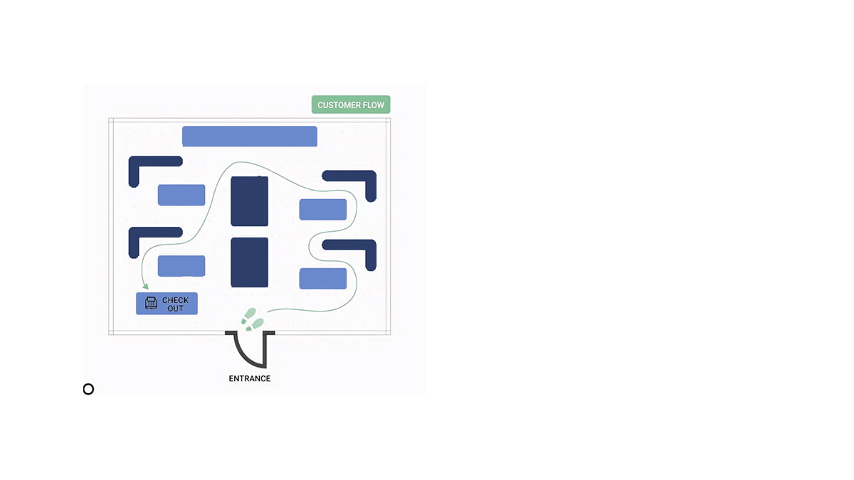
2. Circle
Characterized by a precisely defined customer path, often with an “island” in the middle of a square-shaped space. Designers may emphasize the path with different colors or lighting. It’s an opportunity for storytelling through marketing messages on the walls and is commonly found in drugstores, accessory shops, and kitchenware stores.
While excellent for larger spaces, smaller retail areas might benefit from other solutions.
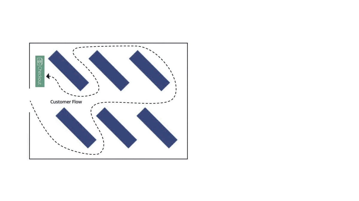
3. Diagonal
As the name suggests, this layout involves shelves set at an angle, providing clear visibility for employees. Suitable for self-service, it’s commonly used for selling electronic devices, cosmetics, and makeup. Ensure that the passages between shelves aren’t too narrow, allowing each customer their personal space. Also, note that there’s no shortcut for customers to reach a specific product, which could be frustrating.
4. Path
Not a circular path, but a labyrinth-like route through the store. Ideal if you want customers to perceive the store as larger than it is and spend more time exploring. Customers are directed through the store to expose them to various product combinations. Often seen in furniture stores, home decor shops, and showrooms.

5. Curved
This layout employs circular shelves of varying sizes. It can contribute to giving your store an exclusive feel, often found in stores selling designer and artistic pieces. While it may display fewer items and not maximize space, the focus here is on creating a sense of luxury.
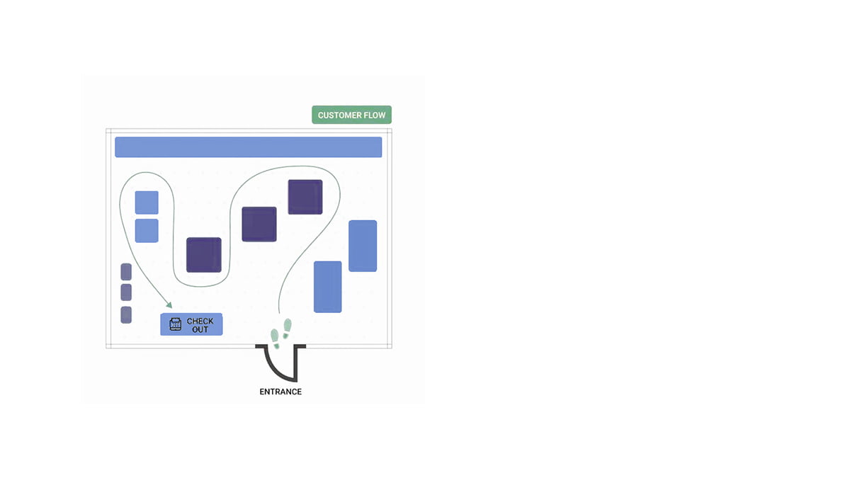
6. Free Movement
This foundation allows for changes in shelf placement and the focus zones for priority products. It adds a creative touch, making the entire store visible from all angles. Suitable for smaller inventories, it provides flexibility but may confuse customers who are used to a more guided shopping experience.
How to solve this issue?
In the next article, we’ll uncover the secrets of customer behavior in retail spaces. Expect insights into store boundaries, the importance of customer personal space, techniques for proper cash register positioning, and how “slowdowns” play a crucial role. Don’t miss the opportunity to become a master at attracting customers and creating an unforgettable shopping experience!


